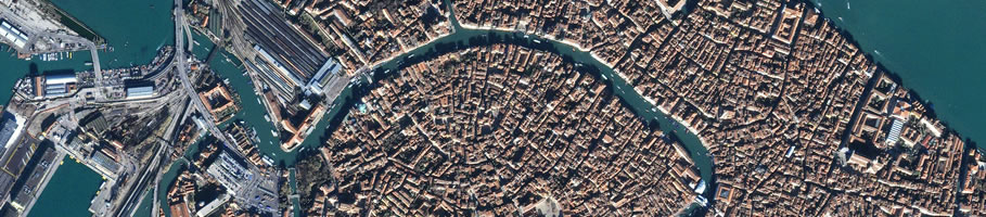

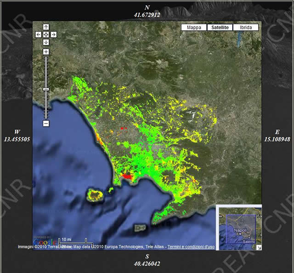
Thanks to an interface based on a GoogleMap technology, it is possible to access all the data concerning the earth deformation using satellite data very easily.
In the deformation maps the green dots represent the stable zones, while the red or purple ones indicate areas that have deformed. Clicking on any colored ball, you can see a graph showing the trend of the deformation over time (remember to unblock popups!)
Click on this link to see the results of some areas where we processed the data: